Kråkmo Chronicles
Designing the Feeling: Building the Identity of Sommerfest på Sveian
Date:
June 01, 2025
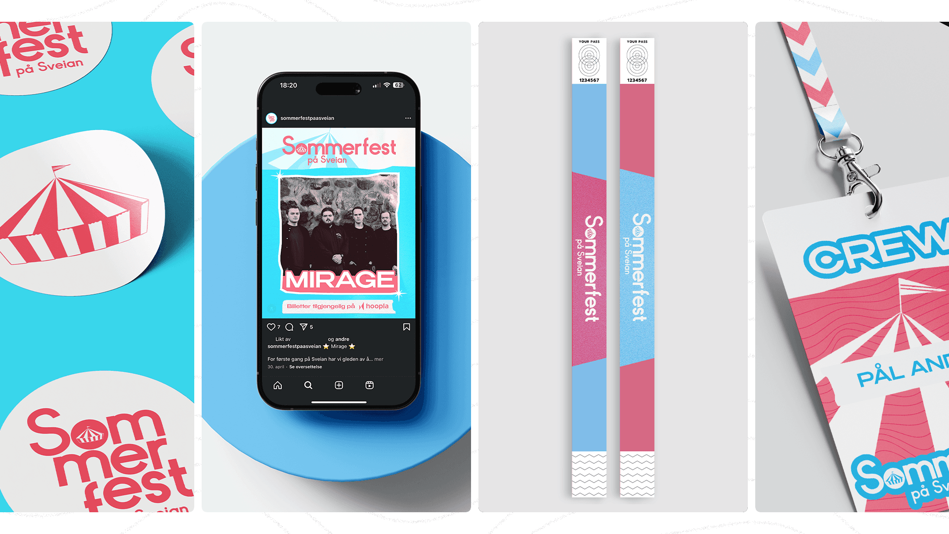
Sommerfest på Sveian isn’t just a local summer festival — it’s a nostalgic, music-filled weekend that brings a whole community together. For this year’s edition, I was brought in to shape its visual identity from the ground up. From posters and social media content to wristbands, passes, and the official logo, every design element was crafted to reflect the heart of the festival.

Understanding the Concept
Sommerfest på Sveian is more than a festival — it’s a celebration of local culture, friendship, and the kind of summer nostalgia you only get once a year. The concept wasn’t about being flashy or corporate. It was about tapping into something warm, familiar, and welcoming. I needed to translate that feeling into a visual identity that felt effortless yet intentional — something that spoke to both returning guests and new faces. The goal was to reflect the essence of Sveian itself: a place where music, laughter, and grilled food blend into memories.
Strategy and Positioning
The visual identity had to stand out, not just in print or online, but across every point of contact. The strategy was rooted in consistency and atmosphere. We created a cohesive system that worked across multiple platforms, including digital posters, social media, printed materials, wristbands, passes, and more. Each piece worked to establish the same emotional tone — vibrant yet not overwhelming, playful yet not too polished. Together with the client, we made sure everything connected back to the core of the festival: joy, simplicity, and togetherness.
Creative Development and Design
The design language was built around bold colors, soft retro typography, and tactile, summer-inspired graphics. We leaned into a playful, slightly vintage aesthetic — the kind that evokes old festival flyers and sun-faded signage. The logo was designed to be flexible across various media while still maintaining a unique and handcrafted feel. We built a toolkit of visual elements that allowed for variation without losing cohesion. Every asset — from wristbands to Instagram stories — was shaped to feel personal and rooted in the place and people behind the event. Working closely with the client allowed us to fine-tune the details, adjusting them as needed while staying true to the visual tone we established early on.
Conclusion
This project was about more than design — it was about capturing a feeling and giving it form. Working on the visual identity for Sommerfest på Sveian meant building trust with the client and helping shape an experience that would stay with people long after the weekend ended. It reminded me that the most minor details — a pass that feels good in the hand, a social post that makes someone smile — are part of something bigger. Design isn’t just what people see; it’s what they remember.